top of page

Golden Ice Cream Brand Refresh
Case study
The Challenge
A small ice cream shop located in McAllen, Texas, was looking to exceed the quality and service of other local frozen dessert shops. The owner sought to break out of the "Mom & Pop Shop" category to sell the story of quality that the brand carried.
The goal was to create branding to convey the quality, authenticity, and inclusiveness of the company and to do it before their first summer.
Outcome
I created new brand values and clarified the brand's purpose. I created a fresh and consistent brand, including a refreshed logo, standardized color palette and font selection, brand patterns, on-brand signage, new employee uniforms, and branded merchandise.
Golden Ice Cream's (GIC) owner has gained confidence with plans to expand to more locations within the same year. The brand is more recognized in the saturated market in which it competes.
Developing the Strategy
I interviewed the owner (Sonia Marroquin) for hours, asking questions about her goals for the business, the business's origins, the brand's purpose, what customers say when they talk to employees, her core values, and a myriad of other high-level and in-the-weeds questions.
There were three reoccuring traits throughout the owner's experience and vision. Quality, inclusivity, and authenticity was infused in the way the employees were trained, the way the food was prepared, and the way Marroquin interacted with her customers. I isolated these themes and moved into understanding the target audiences, and then building an identity around these three unique characteristics.
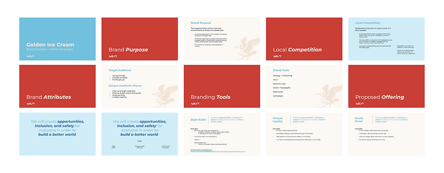
The Target Audiences
Approximately 50% of Golden Ice Cream's employees have disabilities and/or are neurodivergent. Marroquin's purpose is to provide quality work experiences for those who don't get chances from other companies. GIC proves daily that disabilities don't define a person, and that a business can thrive when taking care of its employees.
This is where the idea of making Golden Ice Cream a safe space came from. I determined that they had three target audiences–families, friend groups, and couples on dates. These three groups became the focus of the branding. We determined we needed an elegant, calm, but fun brand to convey a high-quality, inclusive, and authentic brand.

Golden Ice Cream's Purpose

Brand mission

The Golden Way
Golden Ice Cream's Purpose
1/6
The Logo + Colors
Golden Ice Cream's old logo used gradients, a rounded "kiddie" looking font (as described by Marroquin), and a detailed script font that almost worked well. The logo had already gained some precious recognition, so I kept the script font but cleaned it up by removing awkward bumps, aligning the ascenders, raising the descenders, and adjusting the kerning. I included a more structured sans-serif font for the word "Ice Cream," and removed a large ice cream cone that disrupted the hierarchy in the original logo.
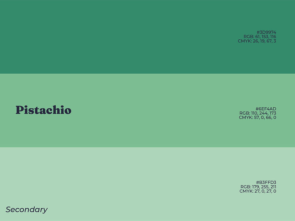
Marroquin and I agreed on a gold, navy, off-white, and blue as the primary colors, with a pink and green as secondary colors. The contrast between the gold and navy created an elegance, while the off-white and blue made the brand feel more lighthearted.

Full Logo Lockup

Secondary Logo Lockup

Shorthand Logo
Full Logo Lockup
1/4

Golden Tints and Shades

Quality Tints and Shades
Pistachio Tints and Shades
Golden Tints and Shades
1/6
Fonts + Patterns
To continue telling a playful but classy brand story, I implemented three fonts including one body font (Montserrat) and two heading fonts (Fraunces and Oleo Script). Fraunces holds an air of responsibility and structure, while Oleo Script feels homemade. Montserrat uses interesting spacing within its letter forms, giving a perfectly simple and geometric font to complement two headings packed with personality.
Two patterns were needed: one to express quality and consistency, and the other to convey inclusion and authenticity. I utilized the iconic style of the brand mark to create a few additional symbols for the second pattern, and used the actual brand mark for the first.

Fraunces Headings

Fraunces Fonts

Montserrat Fonts
Fraunces Headings
1/6

Summer Scoop Pattern

Summer Scoop in Action

Lighting Cones in Action
Summer Scoop Pattern
1/4
Brand Photography
When I was introduced to Golden Ice Cream, the brand's photography was inconsistent and didn't tell a story or make the product craveable.
I wanted to change this by creating two photography styles to feature both the experience of eating at GIC (lifestyle photos) and to clearly illustrate the texture and variety of their ice cream (studio product shots).
I set up Marroquin with on-brand backdrops to feature their ice cream in a studio setting, and shot demonstrative photos for them to reference when creating their own content in the future.

Product Photography
A structured and never-ending multitude of cones.

Lifestyle photography
A young boy taking a bite out of his ice cream cone.

Product Photography
Three scoops of chocolate ice cream are placed in a row on a golden backdrop. They are evenly spaced and neatly aligned.
Product Photography
A structured and never-ending multitude of cones.
1/13
Swag + Additional Collateral
I updated the employee caps with the current branding in a style that felt like "streetwear." Additionally, I designed two shirts and received customer feedback until it became something customers said they would LOVE. Keychains, t-shirts, and stickers became marketing assets.
Custom-branded cups set restaurants apart and makes the customer into a walking billboard. I mocked up what their cups should look like, created business cards for the owner, and worked with the owner to create custom tissue paper featuring the Lightning Cones brand pattern to add a little to the customer's experience and for brand recognition.

Treat others kindly t-shirt

Employee uniform cap

The Golden Way Chipmunk t-shirt
Treat others kindly t-shirt
1/3

Golden Ice Cream pints

Stay Golden keychain

Golden Ice Cream business cards
Golden Ice Cream pints
1/4
The Results
The owner plans to open at least one new location within the next year. Marroquin is confident it will be cheaper in the long run due to the clarity the style guide provides to the brand.
Multiple customers have approached the employees about buying a hat like theirs. The swag is being sold as a way to raise money for local families in need of beds, refrigerators, and other necessities, with 50% of profits going to to this great cause.
Marroquin has raved about the branding provided, and feels far more confident creating content and printing any branded assets for the company. Sales have increased, and brand recognition and word-of-mouth referrals are on the up. The owner encourages potential clients of mine to call her to hear her perspective on the process and to better understand why branding is vital for even small businesses.

bottom of page