top of page

UNIQ Supply Rebrand
Case study
The Challenge
An e-commerce disposable goods company built up 4 brands over several years. Maintaining these four distinct brand styles confused the internal culture and required significantly more resources than maintaining a single brand.
The company's revenue had also been shrinking, so we needed a new strategy to get out of this financial hole.
The executive team decided to consolidate the brands to fix this. I was tasked with leading a team of two designers and a fractional CBO to execute.
Outcome
Our efforts amounted to a new target audience, brand values, and brand identity with additional assets.
The company earned #1 Places to Work in Idaho soon after the release of the new branding. The average employee tenure length increased.
The first full year after this branding was released, UNIQ Supply's revenue grew by over 20% for the first time in years.
Developing the Strategy
We started with questions. What are we known for? What can we be the best in the world at? What is our purpose? Who are we serving? I got answers from the executive team and employees at all levels.
These questions led me to validate the main storefront's (Frozen Dessert Supplies and Hot Cup Factory) previous purpose and values. This background strategy and culture definition set the stage for the creation of UNIQ Supply's visual and verbal brand identity.

The Muse Mindset
UNIQ Supply originally leaned heavily into target audience personas made using just 1-2 customers-worth of research per persona. This led to wildly inaccurate brand targeting and a confused marketing team.
Burke Morley focused more on psychographics and finding the one thing that united our customers: their purpose. We called this the Muse Mindset, as it helped the team make the Food and Beverage Entrepreneurs (FBEs) into a more relatable crowd. I then polled dozens of FBEs to see if the Muse Mindset was correct, and it was spot on ~95% of the time. With the brand's foundation set, we (Hillstead, Harris, and I) moved onto the design.

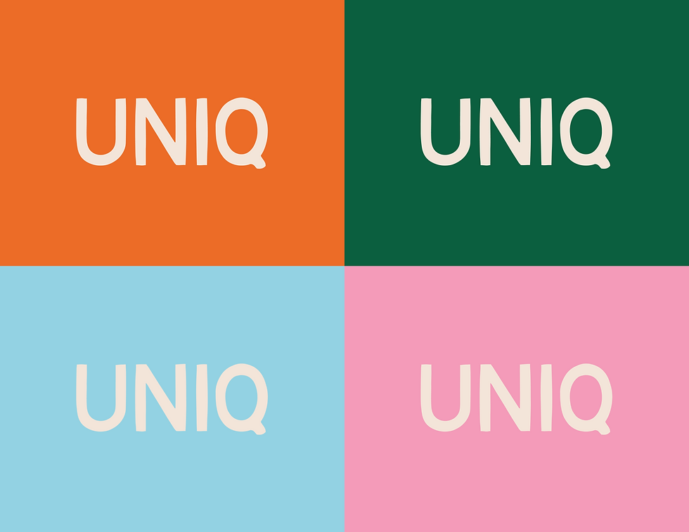
The Logo + Colors
UNIQ Supply is personable and small, but also dependable and a trusted partner for hundreds of FBEs. The logo we designed reflects this, with hand-drawn elements and a structured profile. The four dots tell a story of the primary four Food and Beverage segments the brand specifically caters to, also aligning with the brand's four brand values.
The colors picked for the brand push professional boundaries to reflect the internal culture of the company and to stand out in a world of bland and forgettable B2B competitors. The four core colors are supported by a sandy cream that allows them to work well when paired together.
Strict usage rules ensure the brand stays professional instead of obnoxious when utilizing the color palette.

Primary Logo

Primary Logo on Color
Short Hand Logo on Color
Primary Logo
1/12

Orange Tints and Shades

Romaine Tints and Shades

Neutral Tints and Shades
Orange Tints and Shades
1/6
Fonts + Patterns
The brand's fonts required the same care, reflecting the brand's personal but dependable personality.
Brand patterns utilized the brand's iconic four dots and an extensive icon set designed by Harris. The patterns have been utilized in areas where subtly hinting at the brand is ideal (front doors accompanying the logo, vinyl wall artwork, stylized invitations, packaging, etc.) and they have variations with alternating colors for use on any background.

Avenir Next

Avenir Next Font Descriptions

Gelica Font Descriptions
Avenir Next
1/4

Brand Pattern (without shadows)-1

Brand Pattern (without shadows)

Icon Pattern
Brand Pattern (without shadows)-1
1/6
Brand Photography
Effective e-commerce requires product photos and lifestyle photos. We added a third element: aspirational product photos, highlighting the product in use.
I designed three distinct styles of photography for the brand to bring website users from the homepage to the Add to Cart button.

Aspirational Product Photo

Aspirational Product Photo

Product Photo
Aspirational Product Photo
1/6
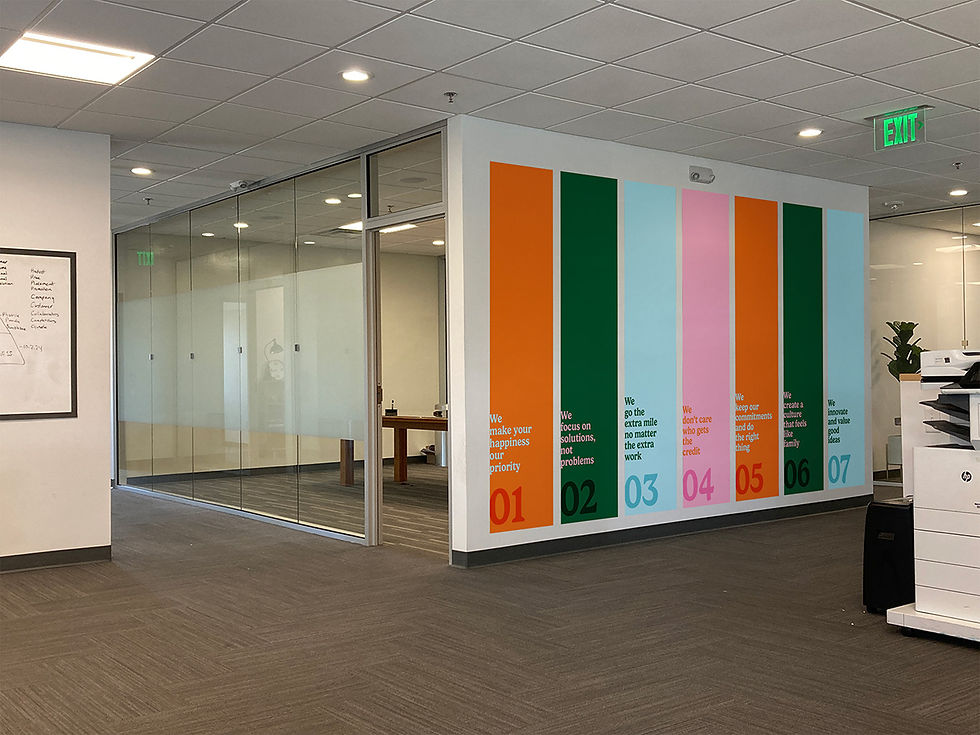
Office Design + Collateral
I branded the office with UNIQ Supply-colored paint and on-brand signage. Employees received a branded swag drop including t-shirts, caps, gift cards to local FBEs, business cards, UNIQ Supply stickers, and digital email signatures + LinkedIn banners.

UNIQ Supply Purpose
UNIQ Supply Core Values

Painting offices
UNIQ Supply Purpose
1/4

Employee T-Shirt Swag

Employee Cap Swag

Ribbon Cutting Drink Menu
Employee T-Shirt Swag
1/14
The Results
Soon after releasing the new branding internally, the company moved from 4th to 1st place in the Idaho Best Places to Work rankings. The culture was already amazing, but the company's leadership vocally attributed the rise in the rankings to the transformation that happened over the time of the rebranding. Being able to unite under a single clear identity boosted moral, purpose, and clarity, and overall satisfaction with the culture.
The UNIQ Supply website is still under construction as of 2025, but there have already been obvious results internally and in the local community. Employee average tenure has already increased since the brand release.
Revenue goals started to get hit more frequently due to a few factors in the business, but one of those was the company's increased unity through this rebranding. The company's largest trade show of the year (Conecon) ended with 2x revenue compared to the previous year, and the first half of 2025 has had record numbers.

bottom of page