top of page


Padre Island Rentals Refresh
Case study
The Challenge
A hospitality company specializing in short term vacation rentals had existed for more than forty years and was the most established in their geographic market. The company had never previously established a brand strategy or developed a visual identity, leading to a forgettable experience due to major similarities between the company and local competition.
The company was rated lower than all competitors on Google. This was mostly due to the quality of their rentals and an overall lack of consistency in the customer experience, as found through market research and reviews.
A co-owner reached out to me to establish brand standards to break them out of the unmemorable, low quality reputation they had built. I directed the process from strategy to execution.
Outcome
Our efforts amounted to an established brand strategy, full visual brand identity, and a clear direction for the ideal employee culture.
The company leadership gained clarity that they hadn't achieved in over forty years. This affected the company's culture and employee buy-in.
The refreshed brand has yet to be fully implemented, as we've found a more gradual release scheduled around the company's busy season to be the best way to maintain existing brand equity.
The project ended with the printing of a brand bible, outlining strategy, voice, and visual identity. Here is a link to the digital version of the brand bible.
My Contribution
-
Brand research and consulting on the direction of the project, from high-level to everyday decisions on the brand's development.
-
Brand strategy including defining the brand's purpose, vision, mission, positioning, core values, brand values, and personality.
-
Created the story of the Sandpiper to represent the guest and ideated the logo idea.
-
Established the brand voice and tone, defining what it sounds like and key language to use.
-
Developed the brand's tagline.
-
Ideated and designed the brand identity from scratch (sans the company name), including the logo system, color system, type system, photography styles, iconography, textures, patterns, and additional collateral.
-
Produced 100% of the content found within the Brand Bible, including (and not limited to) brand identity, photography, visuals, copy, layout, and strategy.
-
Designated rules around the use of key brand assets.
-
Established brand scents.
-
Created a brand music playlist.
-
Presented all information to key stakeholders, considering feedback and implementing revisions as necessary.
Developing the Strategy
I began with questions. Digging into the core of the company, I searched for answers pointing toward Padre Island Rental's purpose for existing, their vision for the future, and what makes them unique. There was no clear answers given to me by the executive team or employees at all levels, so I interviewed multiple people who knew the company from varying vantage points. This gave me a larger picture of the brand's story and where some of their strengths and weaknesses laid.
These questions informed me on the company's purpose, values, and other core positioning and strategy statements. I consolidated this into statements and presented it to leadership. It resonated with them and they approved it. This background strategy and definition of the company's culture set the stage for the creation of Padre Island Rentals' visual and verbal brand identity.

Differentiating PIR
Padre Island Rentals' (PIR) focus was split between serving their guests and serving the property owners. Now, with a defined brand strategy, the focus was on the guests they serve. The understanding was that the property management side would flourish when the guest experience retains and acquires new customers.
To help PIR stand out in the market, I researched the competition. I found some consistent cliche's in competing logos, including things like sun and wave imagery, blues combined with yellows, and tons of palm trees. We decided to stay away from these cliches to better separate PIR from others.

The Sandpiper
I wanted to tell Padre Island Rentals' story while also communicating that the company's focus was on the guest. After studying the competition, I discovered that a minimalistic mascot logo would uniquely differentiate PIR while also communicating that they are family-friendly, since moms are their largest target customer.
I searched for stories to tell that fit the brand's strategy and the story they were attempting to communicate. Eventually, I came across the story of the sandpiper; a native bird that perfectly resembles PIR's guests.
I built an iconic mark with the sandpiper as inspiration. The bird's body is facing left while its beak is facing right, communicating that even while our guests are heading home, they will be looking to the future opportunities they will have to stay with Padre Island Rentals.
The brand's word mark continues with symbolism. The thin slab serif font has thinner serifs toward the bottom of the letterforms to symbolize establishment while also visually representing the condominium towers making up the island's profile.


Primary Logo

Primary Logo

Word Marks
Primary Logo
1/10

The Sandpiper Breakdown

Primary Logo Spacing

Logo Do Nots
The Sandpiper Breakdown
1/7
Brand Voice + Messaging Pillars
Establishing a consistent communication style was crucial for providing a reliable guest experience. After interviewing members of the staff and mulling over the brand's strategy, I created brand voice standards and messaging pillars to aid in everyday guest interactions and marketing communication.
Each piece of the voice was intended to raise the quality of the customer experience and the company's relatability. The pillars had a similar goal, in helping build trust and less friction in the customer's decision-making process.

We are Educated and Discerning

We are Confident and Nostalgic
We are Educated and Discerning
1/2

Quality Experiences Pillar

Reliability Pillar

Transparency Pillar
Quality Experiences Pillar
1/3
The Colors
Resuming the themed storytelling, I created a color scheme to resemble the beach setting of these vacation rentals. Many competitors utilize a bright blue + bright yellow/orange combo, so I wanted to move in a more mature direction.
The solution was to use a darker blue with a yellow that is almost gold to convey experience and luxury. In the primary color palette, I included an emerald green to continue communicating the premium quality of these properties while also introducing a color that none of the competition uses. This ensured the brand is memorable when compared to others in the market. Each color represents the beach/oceanic experience in one way or another.

Brand palette

Baltic tints and shades

Brand grayscale
Brand palette
1/8
The Fonts
A balanced slab serif, traditional serif, and sans serif font were each selected to tell the brand's story of establishment, experience, and effectiveness. Hepta Slab and Open Sans work well on their own, but by introducing the secondary, more stylistic serif font (Poltawski Nowy), the visual identity became dynamic.
With specific use-cases, each font contributes uniquely to the brand's image. Hepta Slab contributes a sense of establishment, while Poltawski Nowy introduces a more regal sense of style. Open Sans is void of much personality, allowing the two heading fonts to really shine.

Hepta Slab

Hepta Slab

Open Sans
Hepta Slab
1/6

Mailer Front_2x

PIR_KeycardLockup_V2

PIR_Letterhead_V1
Mailer Front_2x
1/4
The Three Photography Styles
To guide guests through rebooking, I create a series of three photography styles to help guests picture the experience they could have if they booked through Padre Island Rentals.
Editorial: A top-of-funnel style intended to showcase and sell the island experience. These shots are intentionally plainly edited, with HDR quality and high contrast, shot from a perspective guests could easily experience themselves (not from a worm's-eye or bird's-eye view). The intention? To convey real and achievable sights and experiences that the guests could reasonably have.
Interior Design: Top performers on Airbnb and VRBO often had something in common: they used interior design style photography to communicate a mood, as opposed to real estate photography, which simply communicates basic facts. The intention is for each home's photos to be a little different to match the unique charm of the property. This is to assist guests in knowing what they're getting into when renting a vacation home online.
Texture: Like high-end editorial photography, these tactile images evoke the physical sensations of South Padre Island: the grain of the sand, the warmth of the swimming pools, and the welcoming atmosphere of our guest center. We use this photo series across our marketing collateral to intentionally trigger fond memories for returning guests.
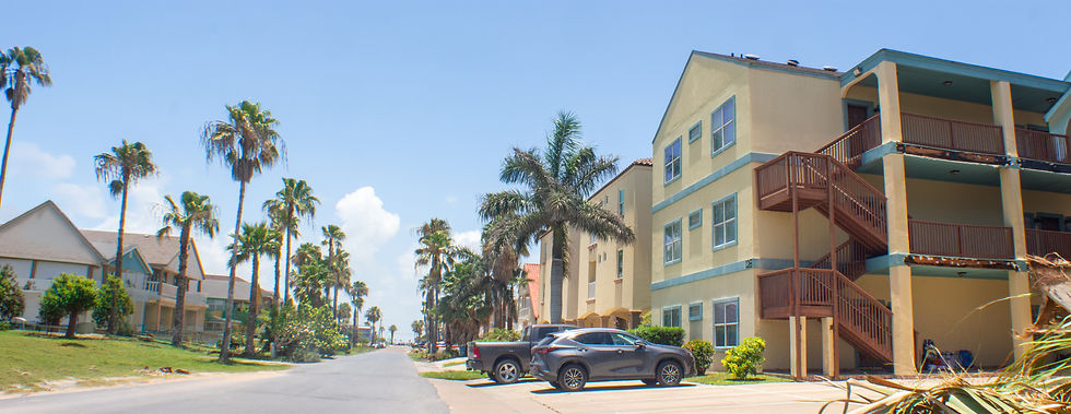
Condominiums

Sand castle building

Heading out
Condominiums
1/9

Isla_8

Star_3

Cabo_2
Isla_8
1/12

Texture_Pool

Texture_Sand_2

Texture_Sand_3
Texture_Pool
1/7
Auxiliary Brand Assets + Collateral
To add to the brand's presence, I produced a few additional assets.
I created a set of 140 custom icons to spell out amenity offerings, contributing to clear communication with customers.
I produced two brand patterns to build subtle brand recognition and to add diversity to the brand's visual presence. The "Beach Striped" brand pattern is for more classic and mature uses, while the "Salty" brand pattern is for more playful assets.
To consolidate the many pieces of this project, I produced both digital and physical versions of a brand bible to help employees, contractors, and collaborators have more insight into maintaining the brand's standards.

Brand book cover

Beach Striped brand pattern

Street signs
Brand book cover
1/9
The Results
As of the summer of 2026, the brand is slowly being implemented to maximize the retention of existing brand equity. Internal leadership plans on implementing the brand fully by the end of 2026. The results we've witnessed have so far been intangible, but far from inconsequential.
Brand bibles have been published and will be distributed to stakeholders, key managers, and teams within the company (from accounting to housekeeping and maintenance). Already, the work done throughout this project has granted clarity to ownership, general management, and board members. They each agree that the company hasn't previously had a brand as defined and intentional as this refresh. The majority of ownership recognizes this branding project as a way to move Padre Island Rentals into a multi-generational success, as opposed to the track it was on (a company completely reliant on key people instead of processes).
For a closer look at the full brand bible, follow this link.

bottom of page